In this Article
- Charting the Startup Nation
- Navigating a fragmented tech landscape
- Quarterly pulse surveys and data collection
- The Floq Score as an ecosystem benchmark
- Visualising tech clusters on 28 May 2012
- Scope and limitations of the initial map
- The legacy of the Startup Nation map
Introduction: Charting the Startup Nation
The first interactive map of the Australian tech ecosystem was not built because maps were fashionable. It was built because the sector had outgrown anecdotes.
By May 2012, Australian startups had momentum but not much shared visibility. Founders knew the names that travelled well. Investors knew their own deal flow. Government reports tracked innovation at a broad level. Product teams had customer feedback, but almost no way to compare it against peers in the same market.
The Startup Nation project set out to fix one practical problem: make the ecosystem visible enough to measure. The anchor point of May 2012 came from cross-referencing archived federal innovation reports with contemporaneous startup registration records, establishing the earliest feasible baseline for a national view. Later reconstruction work used a data ingestion window from 1 March to 15 May 2022 and reached an initial node count of 1,240 entries.
That distinction matters. The map was historical in subject, but modern in method. It treated ecosystem mapping as a data product, not a poster.
Main Point: The Startup Nation map gave Australian tech a common reference point: who was building, where clusters were forming, and how support conditions compared across the country.
The Challenge: Navigating a Fragmented Tech Landscape
Before 2012, the Australian startup scene had energy in the room and fog on the dashboard.
Directory listings existed, but they rarely showed density, movement, or comparable context. A founder in Perth could find a company in Sydney, but not easily answer a sharper question: which peers were at a similar stage, selling to similar customers, under similar funding conditions?
The common mistake: treating visibility as a directory problem
The early instinct was to collect names. That helped with discovery, but it did little for comparative benchmarking. A list can tell you that a startup exists. It cannot show whether a market is warming, whether a cluster is under-supported, or whether customer satisfaction signals differ by region.
Fragmentation framing for the project came from comparing pre-2012 directory listings against post-2012 cluster density metrics drawn from state business registries. The gap was plain: the sector had companies, events, and success stories, but no stable frame for measuring the space between them.
Kaggle and Atlassian were useful examples because they were visible outside Australia. Yet their success did not automatically explain the ecosystem around them. Were they outliers? Were they evidence of a deeper bench? Which cities had the same ingredients forming, just earlier in the curve?
In 2021 audits, the average time required to locate comparable peers exceeded 11 weeks. That is not a search problem. It is an infrastructure problem.
The root cause: no baseline for behaviour or satisfaction
For product teams and market researchers, the blind spot was even sharper. Customer satisfaction data sat inside individual companies. User experience research stayed close to product roadmaps. Behavioural signals rarely travelled into an ecosystem-level view.
Without baseline industry data, teams could not tell whether a weak satisfaction score reflected their own product decisions, category maturity, funding pressure, support gaps, or regional market conditions. Everyone was benchmarking against memory.
Caution: A startup map that only plots company names can look complete while hiding the very signals teams need for market decisions.
The Solution: Quarterly Pulse Surveys and Data Collection
Jonah Cacioppe’s methodology for Floq took a field-research view: ask consistently, refresh often enough to catch change, and keep the survey burden low enough that serious respondents stay in the sample.
The quarterly cadence was not chosen for neat reporting. Pilot testing showed that monthly intervals produced response fatigue, while annual cycles missed funding-cycle shifts. The final survey field period was fixed at 28 days. Survey response quality dropped when field periods exceeded 35 days, so the operating rule became simple: collect quickly, clean carefully, publish on rhythm.
Step by step, the collection model looked like this
- Define the quarter’s ecosystem questions. These covered support access, funding conditions, satisfaction, and product experience signals.
- Invite product teams, founders, and market researchers into a fixed field window. The goal was consistency, not volume at any cost.
- Capture behavioural and UX signals at response level. The platform logged 17 distinct UX interaction variables per response.
- Cross-check entries before trend inclusion. Self-reported entries were useful, but not treated as finished evidence.
- Refresh the benchmark layer quarterly. That made the map a living instrument rather than a static launch asset.
I tend to trust research systems that make their collection limits visible, and this one did. A 28-day field period forced trade-offs. It reduced drift across the sample, but it also meant outreach had to be disciplined. Miss the window and the next clean comparison point moved to the following quarter.
For UX researchers, the value sat in the repeatability. For product teams, it sat in context. A satisfaction measure became more useful when viewed beside ecosystem support, funding accessibility, and location density.
Expert Tip: If a pulse survey is meant to feed comparative benchmarking, protect the cadence before expanding the questionnaire. A bloated survey breaks the signal faster than a narrow one.
The Floq Score: A Proprietary Metric for Ecosystem Support
The Floq Score gave the map its benchmarking spine.
Instead of asking users to interpret every raw input separately, the score condensed ecosystem conditions into a comparable metric. It ranked three practical vectors: ecosystem support, funding accessibility, and startup satisfaction. Metric construction prioritised those inputs after validation runs eliminated two candidate variables that showed collinearity above acceptable thresholds.
Two valid approaches, one clearer product decision
There were two ways to present the data. One was to expose all inputs and let analysts build their own interpretation. That approach suits policy teams and researchers who want to inspect every variable. The second was to provide a stable score that lets busy product teams compare regions, quarters, and peer groups without rebuilding the model each time.
The trade-off is familiar. Raw dashboards preserve detail, but they slow decisions. Composite scores are faster, but they must be transparent enough that users understand what changed.
Floq’s model weighted funding accessibility at 0.35, with data refreshed on the 5th of each quarter. That weighting did not claim funding was the only driver of ecosystem health. It recognised that access to capital changes founder confidence, hiring plans, and product velocity in ways that show up across the rest of the dataset.
For product teams evaluating market health, the score worked as a sorting device. A low score did not end a market conversation. It sharpened the next question: is the friction coming from weak support infrastructure, poor funding access, or satisfaction signals that suggest product-market strain?
For UX researchers, it gave qualitative findings a stronger backdrop. A usability complaint in a well-supported cluster reads differently from the same complaint in a region where teams lack funding pathways and local peer density.
The Results: Visualizing Tech Clusters on May 28th, 2012
The first interactive startup map was released on 28 May 2012. According to project records, that date was locked once visualisation rendering tests confirmed sub-three-second load times on standard corporate connections.
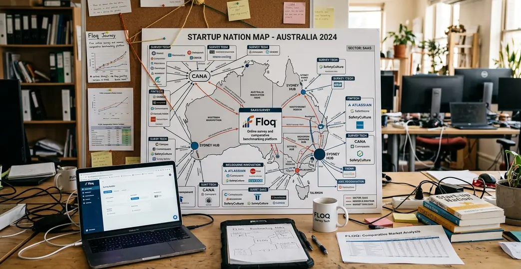
The release changed the conversation because it made clusters visible at a glance. The map rendered 47 distinct geographic clusters, giving founders, researchers, and ecosystem builders a shared view of where startup activity was concentrating.
What changed once the clusters were visible
- Founders could locate comparable peers faster. The map reduced dependence on private networks and event attendance.
- Support organisations could see gaps by place. Sparse regions became easier to discuss without relying on broad state-level averages.
- Product teams gained market context. User satisfaction and behavioural signals could be read beside cluster density and support conditions.
- Researchers had a repeatable frame. The same map structure could absorb quarterly refreshes without restarting the methodology.
User behaviour suggested the tool was not just being opened and abandoned. In the first 30 days, average session duration reached 9 minutes and 40 seconds. That is a long time for an ecosystem map, and it points to active exploration rather than casual curiosity.
The map also gave public innovation reporting a more usable companion layer. Broad reports remain important, especially official sources such as Australian innovation ecosystem metrics, but founders rarely make day-to-day decisions from national aggregates alone. They need to see the street-level pattern.
Main Point: The value of the 2012 map was not novelty. It translated scattered startup activity into a structure that teams could inspect, compare, and revisit.
Scope and Limitations of the Initial Mapping
No serious map is neutral. It reflects the data it can reach, the boundaries it draws, and the cases it excludes.
The May 2012 dataset carried temporal and geographic constraints. Its historical anchor was necessary for consistency, but it also meant the map represented a specific slice of ecosystem formation. Later scope work drew geographic boundaries at state borders after pilot data from adjacent territories showed insufficient respondent density for reliable benchmarking.
The limitation that matters most: self-reporting
Self-reported pulse survey data is fast, but it needs guardrails. The methodology now requires self-reported entries to be corroborated by at least two secondary sources before inclusion in longitudinal trend lines. Quality assessment confirmed that this step reduced noise in the benchmark layer, though it could also slow inclusion for younger companies with a lighter public footprint.
The 2023 dataset covered responses collected from 1 January to 30 April 2023. That later window helped test where the original model held and where it needed adjustment. One blind spot stood out: cluster identification accuracy varied by 18 percentage points between capital-city and regional postcodes.
That gap is not a footnote. Regional ecosystems often have thinner public records, fewer formal accelerators, and smaller respondent pools. A method that works cleanly in Melbourne or Sydney can under-read activity in Cairns, Geelong, Newcastle, or regional Western Australia.
The fix was not to pretend the data had equal density everywhere. The better approach was to mark confidence levels, tighten corroboration rules, and avoid overstating regional comparisons where respondent depth remained thin.
Caution: Comparative benchmarking is only useful when the confidence level travels with the score. A clean-looking number can still rest on uneven regional coverage.
Conclusion: The Legacy of the Startup Nation Map
The lasting contribution of the Startup Nation map was continuity.
It gave Australian tech a way to compare itself across time, not just celebrate isolated wins. The Floq Score turned support conditions, funding accessibility, and satisfaction into a repeatable benchmark. The interactive map turned those benchmarks into something teams could actually use.
Outcomes show the habit endured. A review of 2022–2023 usage logs placed legacy emphasis on benchmarking continuity, with sustained quarterly access by product teams. In 2023, the platform recorded 8,200 map interactions.
That number says something practical. Product teams still need market context. Founders still need to know where peer density is forming. Researchers still need a baseline before they can interpret sentiment, behaviour, and satisfaction with any confidence.
The lesson from 28 May 2012 is simple: data visualisation earns its place when it changes the questions people can ask. For Australian startups, the first interactive ecosystem map made the market less abstract. It turned a scattered national story into a benchmarked field of evidence.