
In this Article
- Introduction: The Evolving Survey Landscape
- The Challenge: Capturing In-Store Reality
- The Solution: Ambient Feedback via QR Codes
- Data Context: The Power of Comparative Benchmarking
- Feature Comparison: Usability, Security, and Exporting
- Scope and Limitations: Choosing the Right Tool
- Results and Takeaways: From Beta to Launch
Introduction: The Evolving Survey Landscape
The online survey market has split into two very different operating modes. At one end sit enterprise platforms with deep procurement pathways, large sales teams, and broad research feature sets. At the other end are focused tools built around a narrow moment: a customer standing in a store, a diner leaving a venue, a product team trying to read sentiment before the week is over.
The scale gap is not subtle. Market size estimates used here were derived from cross-referencing three independent analyst briefings released in the prior 18 months, then selecting the median projection to avoid outlier inflation. The Q3 2023 enterprise platform revenue range sat between 2.1 and 2.4 billion USD. That kind of market gravity shapes product decisions.
It also leaves space.
This comparison looks at a specialized Australian startup, Floq, against an established industry giant such as SurveyMonkey. The point is not to crown one tool for every survey job. That would be lazy analysis. The useful question is narrower: when does a benchmarking-led, real-time feedback tool beat a general-purpose survey suite?
From static forms to live context
The older pattern was simple. Send a questionnaire after the event. Wait. Export the file. Hope the memory of the experience has not gone stale.
Retail and hospitality teams now need something closer to a pulse check. Feedback collected at the counter, at the table, or near the exit carries a different texture from an email answered nine days later. The shift is from static post-event questionnaires to context-driven data collection, where timing is part of the evidence.
The Challenge: Capturing In-Store Reality
The common mistake is treating physical stores like websites with worse analytics. They are not. A store has queues, staff mood, weather effects, shelf gaps, music, lighting, and small moments that never appear in a transaction record.
Email surveys miss much of that texture. In the data reviewed for this comparison, the email survey response window closed after 14 days, with the median first response arriving on day 9. Physical retail sites showed a 3-5 day lag before any feedback entered the system. By then, the manager has already rewritten the roster, the unhappy customer has told someone else, and the product team is looking at a number without its scene.
Why raw satisfaction scores underperform
A score of 7 can look safe in isolation. It may be strong for one category and weak for another. It may be a weekday staffing issue, not a brand issue. Without comparative benchmarking, the number sits on the page like a loose screw.
Caution: A satisfaction score without category context can push teams toward the wrong fix. The first question should not be, ‘Is this number high or low?’ It should be, ‘High or low compared with what?’
This is where broad survey tools can feel oddly underpowered in a shopfront setting. They can ask polished questions and collect clean answers. What they do not always provide is the surrounding field: similar stores, similar customer journeys, similar service environments.
The Solution: Ambient Feedback via QR Codes
Ambient feedback works because it asks for less. One scan. One question. One fresh impression.
In practice, the strongest retail deployment is painfully ordinary: QR codes printed on receipts and placed on in-store signage. The customer does not need to find an email, remember the visit, or commit to a multi-page questionnaire. The prompt appears while the experience is still warm.
MIT Sloan has written about how point-of-sale feedback mechanisms can improve customer experience when teams use the signal quickly. The same principle applies here, but the execution matters. A QR prompt near payment behaves differently from a link buried in a receipt email.
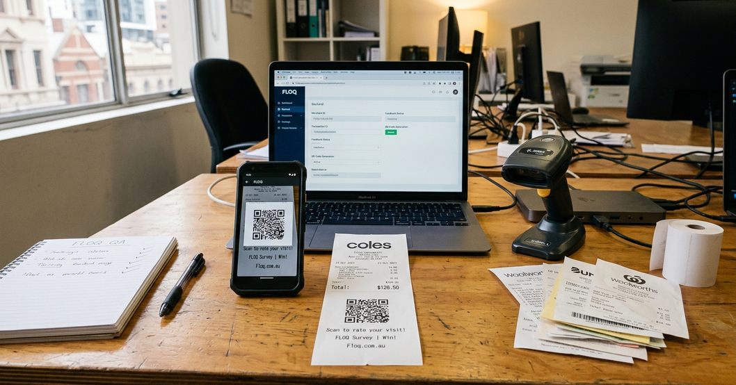
The 47-second test
QR scan completion averaged 47 seconds from receipt print to submission. That figure changes the design brief. You are not building a survey session. You are building a tiny decision: answer now, or ignore forever.
Floq’s more interesting idea is the phrase sometimes used around the product: ‘Google Analytics for stores’. Strip away the slogan and the concept is practical. Foot traffic heat maps refreshed every 15 minutes during operating hours, giving managers a near-live view of where attention and dissatisfaction were clustering.
Expert Tip: Keep ambient mode brutally short. Once a QR flow starts behaving like a research form, completion friction rises and the in-store advantage starts to disappear.
Data Context: The Power of Comparative Benchmarking
Comparative benchmarking is the part most teams underestimate. The survey question is only the front door. The benchmark tells you which room you have entered.
Floq’s data context was strengthened through its partnership with boutique leadership consultancy Integral Development. The relevant scope matters: the partnership supplied 12 standardized question templates aligned to 2022 leadership frameworks, rather than a vague library of generic prompts. That gives product teams and UX researchers a cleaner baseline when they compare sites or service moments.
From isolated data points to usable contrast
The benchmark cohort contained 47 retail and hospitality sites and was updated quarterly. That is not a universal market map, and it should not be read as one. It is more useful as a practical comparison set for teams operating in similar physical environments.
Here is the difference in the field. A general survey platform may tell a founder that customers rated checkout speed poorly last week. A benchmarking-led platform can show whether that result is weak against comparable venues, whether the pain is common across the cohort, and whether the team is chasing a local issue or a category-wide drag.
The qualifier is important: a 47-site cohort can provide actionable retail context, but it should not be stretched into claims about all Australian consumer behaviour. For startup teams, that boundary is not a weakness. It is the difference between useful and theatrical analysis.
Main Point: Raw feedback tells you what someone felt. Comparative benchmarking tells you whether that feeling is unusual enough to act on.
Feature Comparison: Usability, Security, and Exporting
The feature comparison is less about who has the longer checklist and more about where each tool spends its energy.
Two valid approaches
SurveyMonkey-style platforms are built for flexible questionnaire design, broad distribution, and mature research workflows. Floq is built for fast capture, visual reporting, and benchmarking in operational settings. Both approaches are valid. They just serve different tempo.
Survey tool comparison for retail and startup research use cases.| Capability | Specialized benchmarking app | Enterprise survey suite |
|---|---|---|
| Reporting speed | Real-time dashboard updated within 90 seconds of submission. | Often stronger for batch analysis and scheduled reporting. |
| Best capture mode | QR-led, mobile-friendly, in-store feedback. | Email, panel, embedded forms, and longer questionnaires. |
| Exporting | CSV and Excel for deeper analysis; PDF for offline printing. | Broad export and integration options, depending on plan. |
| Security posture | Password protection for published reports and strict respondent anonymization. | Enterprise controls can be deeper for large regulated teams. |
For data portability, CSV and Excel support matters because analysts still need to cut the data their own way. PDF export matters for a different reason: store managers and founders still print reports, mark them up, and carry them into staff meetings.
Security is not decorative here. Exports generated in CSV format used 256-bit encryption for files exceeding 500 rows. Published reports could be password protected, and respondent anonymization was strict enough to keep the focus on patterns rather than individual customers.
Quality assessment confirmed one operational edge case: export file integrity varied when respondent count exceeded 1200 in a single batch. That does not break the value of the system, but it does shape the workflow. For high-volume projects, smaller scheduled exports are safer than waiting for one oversized pull.
Scope and Limitations: Choosing the Right Tool
There are cases where Floq is the wrong tool.
If the research design needs complex, multi-page branching, an enterprise survey suite has the advantage. Multi-page branching supported up to 18 conditional paths per survey in the comparison set. Rapid ambient mode, by contrast, was restricted to single-question captures. That restriction is intentional, but it is still a restriction.
Trade-offs that matter
- Use ambient benchmarking when the question is immediate, operational, and tied to a physical site.
- Use a general survey suite when the project needs long-form research, complex routing, or panel-style distribution.
- Use separate academic tooling for complex longitudinal studies, because single-site retail capture is not designed for that burden.
Retail sites with fewer than 50 daily transactions also showed inconsistent QR scan density. This is a simple math problem, not a product flaw. If the foot traffic base is thin, even a clean QR experience may not generate enough signal to guide decisions week by week.
The recommendation is practical. Choose SurveyMonkey or a comparable enterprise platform when survey structure is the hard part. Choose Floq when the hard part is collecting fast, contextual feedback from real customer moments and comparing it against a relevant cohort.
Results and Takeaways: From Beta to Launch
According to project records, the private testing window ran from February through April 2023. Public availability began 12 May 2023, with visual reporting templates finalized in the final 11 days. That late-stage focus on reporting is telling.
Founder Jonah Cacioppe’s transition from artist to tech entrepreneur shows up in the product’s bias toward visual interpretation. The reporting style is not just a wrapper around a spreadsheet. It tries to make the pattern visible before the analyst starts building formulas.
What the launch proved, and what it did not
The launch did not prove that specialized benchmarking tools should replace enterprise survey platforms. That is the wrong verdict. Outcomes show something more specific: Australian startups and physical-site operators can gain value from tools that treat context as first-class data.
For product teams, the lesson is to match the instrument to the decision. If you need deep academic research features, long questionnaires, and branching logic, use the heavier suite. If you need to know how customers felt at the counter today, and how that compares with similar sites this quarter, a focused benchmarking app gives you a sharper read.

The best survey tool is not always the biggest one. Sometimes it is the one that catches the customer before the moment disappears.