
What Customer Friction Actually Means
Customer friction is the measurable resistance a person encounters while trying to complete a job. It manifests as extra steps, waiting, retries, and dependence on support. Satisfaction tells you a customer felt bad. Friction tells you exactly where and why the process broke.
Friction operates as a leading, process-level signal. Satisfaction remains a lagging, sentiment-level signal. Where event logs capture extra steps over roughly month-long windows, the alignment of survey phrasing to those exact step definitions reveals the true cost of a clunky interface. Waiting intervals recorded in short increments provide a concrete measure of delay that sentiment scores simply cannot quantify.

Why Satisfaction Scores Arrive Too Late
The standard approach relies heavily on post-journey metrics. Satisfaction and NPS are captured after the experience concludes. This aggregates many distinct moments into one blunt number.
The root cause of missed churn signals lies in this aggregation lag. Placing metrics after journey completion demonstrates how severely this delay impacts decision-making. CSAT collected two to three weeks post-completion obscures the immediate reality of the user's struggle. A stable CSAT can mask rising effort.
Customers push through friction until they quietly churn—a silent attrition that sentiment scores miss entirely.
The fix requires shifting the measurement timeline. Effort tracked weekly before any score update provides a leading indicator of user frustration. Sentiment metrics tell you something is wrong, but they fail to localise which step broke.
The Four Friction Signals Worth Benchmarking
Moving beyond sentiment requires tracking specific behavioral and self-reported indicators.
1. Task Effort
This measures how hard it felt to complete a core job. It combines the Customer Effort Score with observed step counts and error rates. Where survey responses diverge from clickstream data in self-service flows, pairing each survey item with its matching behavioral event definition bridges the gap between perception and reality.
2. Time-to-Value
This tracks the elapsed time from sign-up or intent to the first meaningful outcome. Time-to-value measured from sign-up to first outcome, often within a few days to a couple of weeks, highlights onboarding drag before a user abandons the platform.
3. Failed Journeys
These are the abandonment points, dead ends, and tasks started but not finished. Tracking these pinpoints the exact coordinates of user failure.
4. Support Dependence
When self-service fails, users escalate. Support contacts logged only after three self-service attempts indicate severe process failure rather than simple user preference.
Main Point: Leading friction signals isolate the exact step causing user resistance, allowing teams to intervene before sentiment drops.
Building a Friction Benchmark That Holds Up
Establishing a reliable measurement framework requires strict sequencing. Pick one high-value journey and instrument it end to end before measuring everything.
Pair a survey signal with a behavioral signal so self-report and observed behavior cross-check each other. Establish an internal baseline over a defined window before comparing to external or category benchmarks. A baseline collected across a full quarter before external reference ensures stability in the data.
Segmentation applied to new versus returning users within the same roughly three-month period prevents skewed averages. Comparative benchmarking demands strict parameters. External benchmarks require identical journey definitions and sampling windows to remain valid.
Sequencing instrumentation before any cohort comparison guarantees the data foundation is solid.
Caution: Rushing to compare your data against industry averages without first establishing a stable internal baseline will result in misleading conclusions.
A Worked Example: Diagnosing a Stalled Onboarding
Consider a product team with steady CSAT but flat activation numbers. Measuring time-to-value and effort at each onboarding step for a single cohort changes the perspective entirely.
Reviewing step-level abandonment counts isolated the integration step as the primary bottleneck. Failed journeys at integration rose from about 12 to 27 instances per 100 starts. Support tickets for that step averaged around 4 per day over the two-week review.
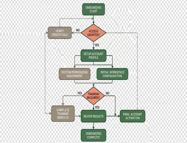
Interestingly, cohorts with high support tickets show stable effort scores when sampled quarterly. This proves that sentiment alone hides acute, localized friction. The behavioral data reveals the real blocker that satisfaction never surfaced.
The Research Team Behind Floq's Benchmarking
Floq's Australian research and product team, operating ongoing since 2021, designs this benchmarking methodology. Their grounding in UX research and market research practice gives these methods a research-backed edge.
The scope focuses strictly on survey instrument maintenance and cohort sampling. Instruments updated on a quarterly cycle maintain relevance. Cohorts refreshed roughly every three months from Australian market panels ensure the comparative data reflects current market conditions.
Expert Tip: Regular cohort refreshes prevent benchmark decay, ensuring your comparisons reflect current user expectations rather than outdated historical data.
Where This Leaves Your Next Measurement Cycle
The shift moves measurement from a single lagging score to a small set of leading friction signals tied to real journeys. Friction and satisfaction are complementary. Friction explains the why behind the score.
Choose one journey, one effort signal, and one behavioral signal. Reducing scope to one journey and two signals for the initial cycle prevents operational overload. A baseline set over the next quarter creates a reliable foundation. Pair an effort signal with a behavioral event from the same period.
Which core user journey will you instrument for friction tomorrow morning?