

If 200 People Answered Instead of 60, Do You Actually Know More?
When a survey wave closes at a higher response rate than the last one, what has genuinely improved, and what has only become more comfortable?
The complete count is larger. The chart looks steadier. Stakeholders may feel more confident presenting the result. Yet the fielding log often tells a more complicated story: the team extended a five-to-nine-day window into commonly around 12 to 18 days, sent a second and third reminder, then introduced an incentive near the close.
Each move changes who answers. Extra completes arriving after the second reminder tend to be active in-product users or incentive-responsive late joiners rather than a random top-up of the original invitation list. A larger count can therefore describe a different respondent mix from the earlier wave.
Response rate is a fielding health metric, not an accuracy metric. It tells you whether an invitation mechanism is producing replies. It cannot establish that those replies represent the population behind the decision.
Read The Field Log
Before celebrating a lift, compare field duration, reminder cadence, incentive type and invitation channel with the previous wave. If those changed, treat the movement in response rate as a fieldwork change first.
The field observations here apply to in-product intercepts, CRM email invitations and third-party panels used by product, CX and research teams. Population-level public-opinion work built on government-grade sampling frames has different design demands.
How the 30% Rule Outlived Its Survey Frame
The familiar “30% or it doesn’t count” rule came from mail and telephone fielding practices spanning the 1970s through the mid-1990s. Researchers usually began with a defined list. When many people on that list stayed silent, nonresponse posed a direct threat to coverage.
Digital survey channels scramble that arithmetic because they start from different bases:
- In-product intercepts may count session-eligible users who had an opportunity to see the prompt.
- CRM email surveys may use the mailed list, whether or not every address was valid or delivered.
- Third-party panels may use an invited slice selected before eligibility screening.
All three numbers can appear under the label “response rate” while describing unrelated invitation mechanics. Comparisons become weaker again when dashboards pool completes, partials, screen-outs and ineligible contacts.
Formal conventions do exist. The published standard definitions for calculating response rates separate case outcomes and denominator choices. Many product dashboards use a simpler completion calculation without documenting those distinctions.
Write the denominator first
Put the denominator into one sentence before fielding begins: “The base is every account active in the prior 90 days that received a deliverable invitation,” for example. That sentence makes later Comparative benchmarking possible. A bare percentage does not.
The Missing Users May Explain the Result
Nonresponse bias depends on two things: the gap between respondents and non-respondents on the item being measured, multiplied by the share who did not answer. The response rate alone reveals neither side of that equation.
Consider an in-product satisfaction prompt. It fires during active sessions, which structurally excludes churned accounts and many disengaged users. The resulting score leans toward people who still use the product enough to encounter the question. More replies from that same channel can sharpen the estimate for active users while leaving the broader customer claim exposed.
Heavy reminder schedules create the mirror-image risk. Three reminders and a prize draw in most situations may attract incentive-motivated respondents with weak product attachment or people moving quickly through the questionnaire. Doubling the complete count after that sequence swaps one bias profile for another; it does not double accuracy.
Compare early and late replies
Split completes from the first 48 to 72 hours from those arriving after the final reminder. Compare the same key measure, along with plan tier, activity and account age. A visible difference does not reveal what every non-respondent believes, though it does show that fielding pressure changed the responding group.
Reminder Bias Check
Keep each reminder wave identifiable in the export. Without that field, the team cannot tell whether late recruitment shifted the result or merely increased the count.
Profile the Sample Before Reading Comments
The most useful first quality check is simple: does the respondent profile resemble the known population behind the claim?
Product teams already hold much of the comparison data. Useful variables include plan tier, account age, seat count, industry vertical, platform, Australian state or region, and activity decile from product analytics. Choose the variables that plausibly relate to the survey topic. A platform split matters for a mobile experience study; seat count may matter more for a B2B packaging decision.
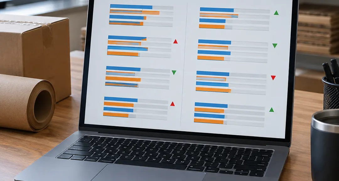
Build a two-column profile before reading a single verbatim:
- List the population distribution for each selected variable.
- Place the respondent distribution beside it.
- Mark where the responding sample overstates or understates a group.
- Decide whether to continue targeted fielding, weight the result or narrow the reported claim.
Quota-managed fielding usually produces the cleanest composition, though it can take longer. Weighting offers a quicker correction when adequate cases exist within each relevant group. Narrowing the claim is often the most honest option when a segment barely appears at all.
A 12% response rate that mirrors the account base is more usable than a 40% rate drawn overwhelmingly from power users. The lower percentage may feel awkward in a deck. Its respondent profile gives the decision-maker a clearer account of who is represented.
Composition Before Commentary
Lock the population-versus-respondent table before coding open text. Memorable comments can otherwise pull attention toward the loudest over-represented segment.
Size the Survey Around Monday’s Decision
Replace “Is the sample big enough?” with a sharper working question: What size of difference would change what we do on Monday?
Each additional complete narrows an interval less than the complete before it. That diminishing-returns curve matters near the end of a stretched wave. The last three to five fielding days rarely tighten the result enough to change a decision, especially when those days rely on repeated reminders to the same reachable users.
Precision requirements also change with the job:
- A directional roadmap read can settle whether a problem deserves deeper discovery.
- A quarterly tracker needs enough consistency to distinguish drift from fielding noise.
- A go/no-go pricing call carries greater downside and usually justifies more aggressive fielding.
Segment reporting raises the bar. Plan-tier and region cuts can split an aggregate sample six ways under normal use, leaving the smallest intended group far thinner than the headline count suggests. Size that smallest reporting cut before launch. The aggregate total is secondary once the decision depends on a segment.
I use the action threshold as the stopping test: if the remaining plausible movement would leave Monday’s choice unchanged, more blanket reminders offer little decision value.
Test Survey Claims Against Product Behaviour
Behavioural validation is the strongest available check on survey quality. Where consent and privacy terms permit, connect respondent-level answers with product events, renewal outcomes or support contacts in the two to six weeks after the wave closes.

The checks should be concrete. Did respondents who said they expected to expand seats actually add them? Have detractors shown declining session frequency in subsequent weeks? Did accounts reporting unresolved friction generate related support contacts?
A mismatch has two useful interpretations. The question may capture intention, aspiration or mood rather than future behaviour. The responding sample may also differ from the people whose behaviour the team wants to forecast. Both findings affect how the result should be used.
Track the relationship across waves
A one-off pulse provides a snapshot and should not be treated as a forecast. Quarterly waves with a stable instrument show whether the relationship between stated answers and later behaviour holds over time. Keep the question wording, event definitions and follow-up window stable enough for Comparative benchmarking.
Privacy boundaries belong in the design, rather than being patched in after collection. Record the permitted join keys and retention terms before launching. If respondent-level linkage is unavailable, compare carefully defined groups and describe the weaker inference plainly.
A Survey Wave That Survives Stakeholder Review
A defensible fielding protocol lets reviewers inspect the choices behind the result. It also keeps consecutive waves comparable when inbox conditions, product activity and stakeholder pressure change.
- Define the population. State exactly which users, accounts or contacts the result will describe.
- Name the denominator. Document whether the base is eligible sessions, deliverable CRM contacts or an invited panel slice.
- Declare the reporting cuts. List each segment that will appear in the final readout and size the smallest intended cut.
- Set two or three composition targets. Choose variables that can materially change the claim, rather than applying quotas to every available CRM field.
- Freeze fielding rules. Cap reminders at a pre-agreed count, commonly two after the invitation. Log every contact attempt and record the incentive type as wave metadata.
- Set the close rule. Close when composition targets are met or the fixed field window ends. Avoid chasing a percentage chosen for presentation value.
A workable quarterly setup
Take a hypothetical B2B SaaS tracker. Its population is accounts active in the prior 90 days. The team sets quotas on plan tier and activity decile, fields for a fixed 10-to-16-day window, and runs an early-versus-late comparison at close. Any segment below its pre-sized threshold receives a clear label in reporting.
This setup may produce fewer completes than an extended campaign with repeated nudges. It produces a cleaner audit trail: who could answer, who did answer, which interventions occurred and where the evidence becomes thin.
Freeze Wave Rules
Record changes to invitation copy, channel, incentives and reminder timing. A tracker loses much of its value when the instrument stays stable while the recruitment method quietly shifts.
Replace the Response-Rate KPI With Two Tolerances
Retire the response-rate target from the research brief. Replace it with two explicit sign-off measures:
- A maximum tolerated composition gap between respondents and the population on named CRM or product variables.
- A minimum detectable difference for the smallest segment the team intends to report.
Agree on both before the next wave launches. Fielding effort will then move away from blanket reminders and toward under-represented plan tiers, activity groups, regions or account types. The close decision rests on evidence tied to the claim rather than a percentage destined for a slide.
The trade-off is real. Composition-led fielding can add days, and weak segment coverage may force a narrower statement than stakeholders requested. That discipline protects the decision from false precision.
Make representativeness tolerance and smallest-segment precision the formal gate for your next survey wave, and remove response rate from the KPI line entirely.